Sometimes it’s easy to decide that things are too difficult to change, or that there are other priorities to tackle. Recently, a new member of our team challenged us about that, and it resulted in a nice bit of joint work to improve things.
Our bin collection data setup
An export from our waste management system containing collection round data set against addresses is consumed by our mobile app and pushed out using an open API.
As we have a friendly supplier in Cloud9Technologies, we were able to agree to it being re-used on our website to replace an old postcode-based lookup table.
Our CMS suppliers, Jadu, built a couple of custom widgets for us to take customer postcode and then push out the results in the same format as the app.
So, a nice re-use of existing tech to avoid reinventing the wheel for a small increase in server calls.
The lookup went live in January 2016 and is sometimes our fourth most visited page on the site. We also threw in some info on our app, and the ability to download a collection timetable.
So everything was good, yes? Well, no.
Listening to feedback
We track customer feedback using GovMetric which lets users tell us if they’ve happy/sad/indifferent to any page or form we use. They can also leave us feedback.
Each month we tally up what the winners and losers are in terms of public feedback. For each month we found that for the bin collection lookup:
- between 38-45% of feedback was positive
- between 55-62% of feedback was negative
But how could we both be meeting needs and frustrating them? We took a deeper look.
What was wrong
From the Govmetric feedback, and observing users using Hotjar, we could see that the key issues driving dissatisfaction fell under three headings.
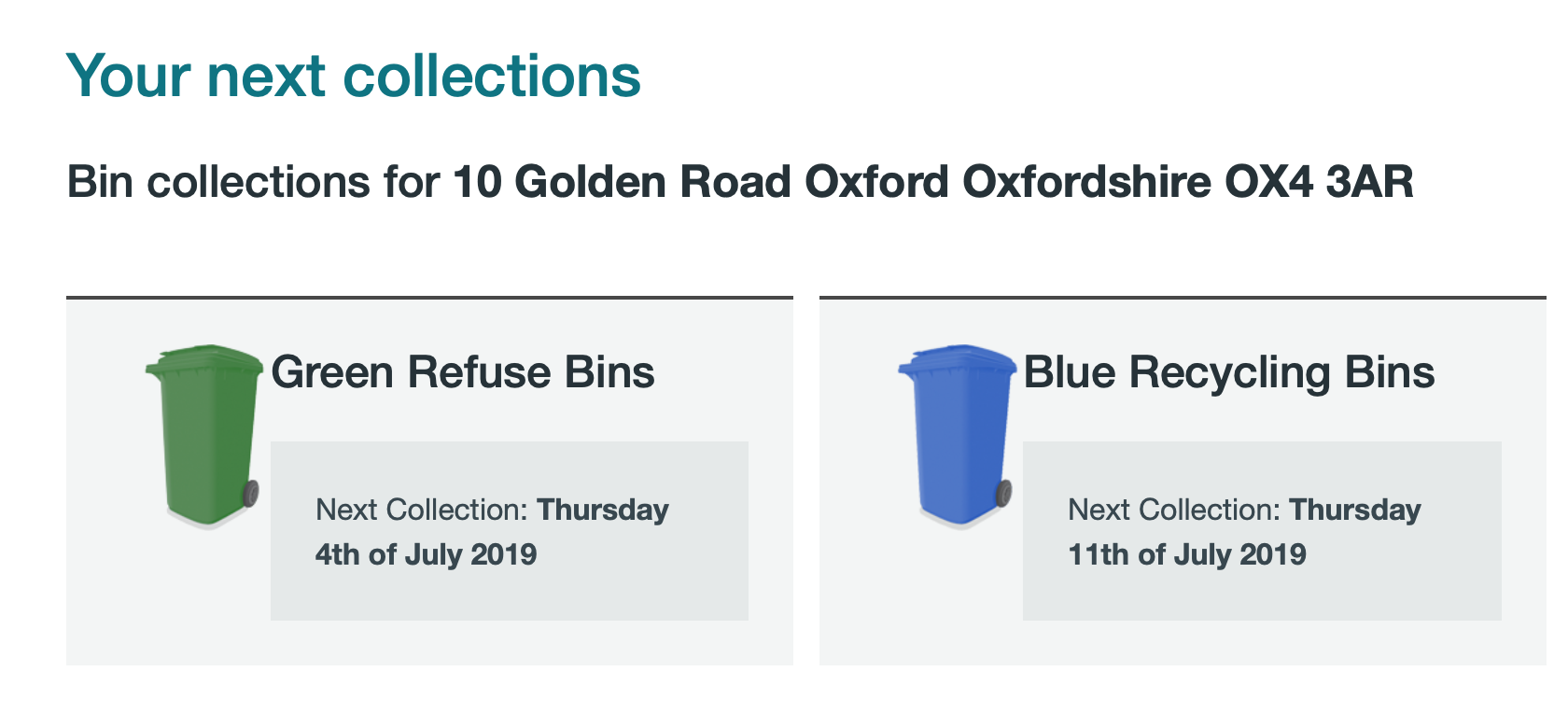
1. Which annual timetable to download
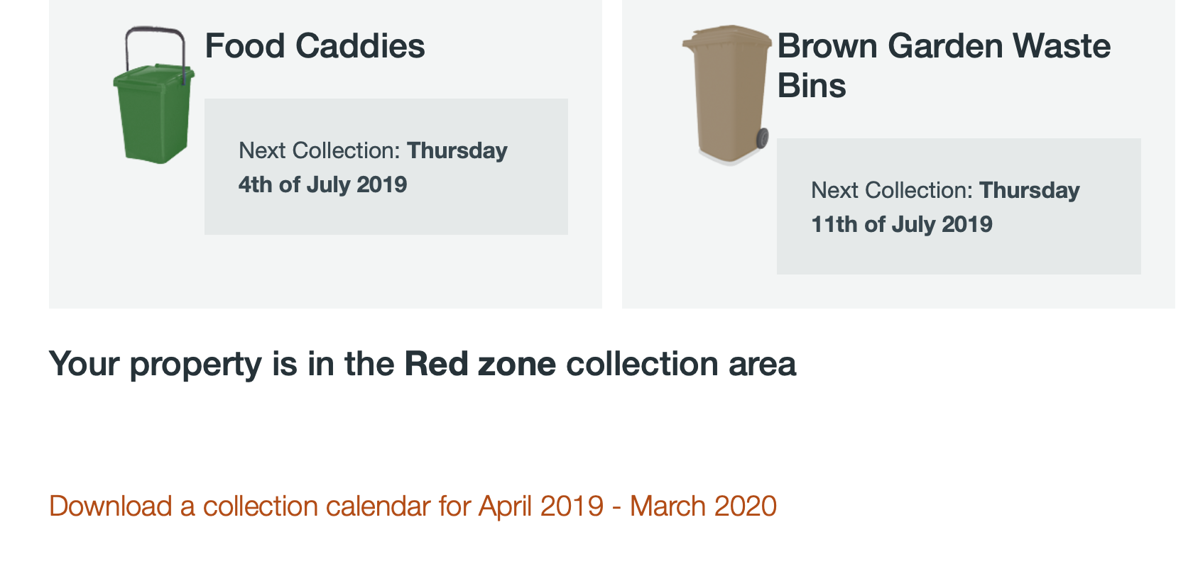
For users successfully returning information on an address lookup, they were offered between a choice of two collection timetable downloads; Red zone or Blue zone.
However, they didn’t know which download to choose as their zone information was returned at the top of the page.
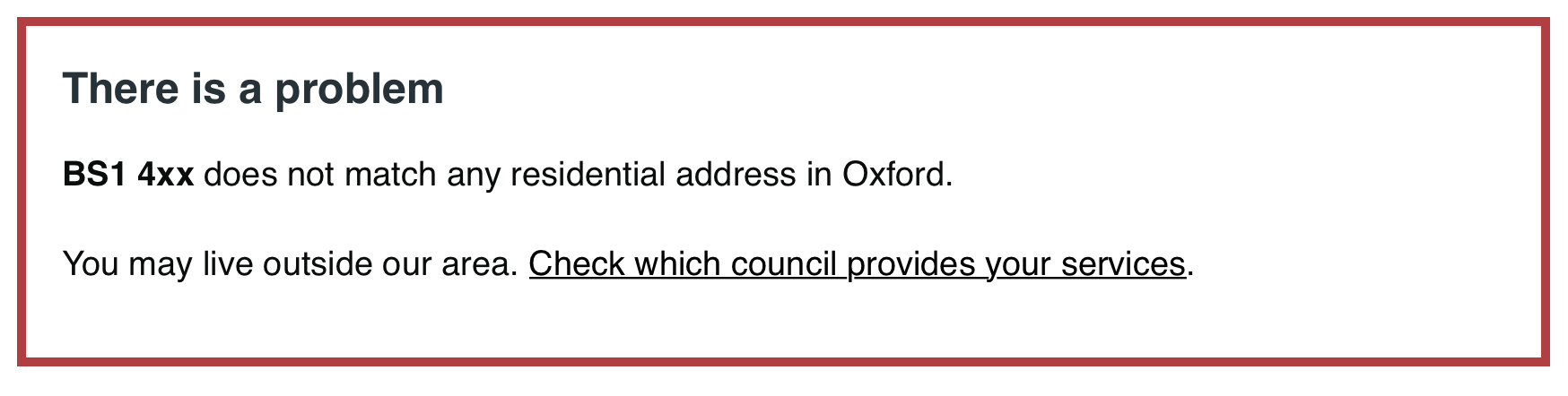
2. Users not being Oxford residents
It was a well known issue that people not served by Oxford City Council were using our lookup for their bin collection information. But the error message they were given was “we could not find any postcodes or streets matching [data entered] which wasn’t specific enough and didn’t let them know what to do next.

Also, we found that the default alert styling for the error didn’t meet accessibility standards as it used a drop shadow on the text.
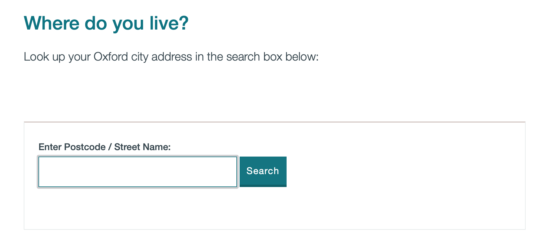
3. A cluttered page
To help avoid people outside of our area using the lookup, we’d pinned some guidance above the address search box hoping people would read this first. But not everyone needed to see this information, and adding it pushed the address lookup refinement selection box further down the page so it wasn’t visible.
We also had information about our mobile app and about the timetable downloads. There was too much going on.
How we fixed it
It was great to bring the different strengths of the team into play to come up with a shared idea of what to do; content, UI and UX.
1. Only showing the correct timetable
With a bit of a hack of the widget PHP we were able to bring back a specific URL for the user to use for a download. The zone information also came down to be near the download link.
2. Creating a better error message
This was a good opportunity to look at the GDS Design system to see what format we should use:
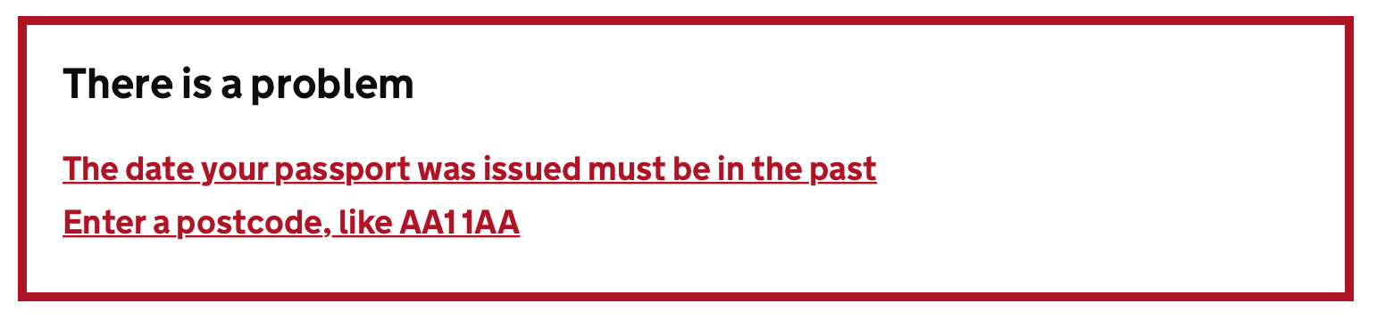
Our first iteration of this was far too wordy, attempting to explain in too much detail what had gone wrong and what to do next. We dragged in a couple of non-team members to test out some ideas and ended up with an easy to read version
When we tried to use the GDS pattern it looked like (as one team member described it) a Parish Church Newsletter as our existing styling clashed with three colours in the message. We took the decision to depart from the recommended style and try our own (for now):
3. De-cluttering the page
The search page now just shows the minimum information needed for users to start their task. No more pre-error message - these now only appear when there is a problem with the address entered (or not entered).
We’ve also removed information on this page about downloads or the mobile app as these are not relevant to the task being undertaken.
The results page has a clearer title, with information on downloads or on using the app as an alternative
Next steps
Obviously we’ll be watching user behaviour on Hotjar to see if things are working better, and listening to feedback to see if we need to do more.
But what we really took from this was:
- we need to challenge ourselves more to ‘have a go’ and improve things. Sometimes they are not as complicated as we think
- it was great working together as a team in coming up with the changes, using each of our strengths in adding something
- we are going to make time to tackle more long standing issues together on a regular basis. Next up is a redesign of our landing pages!
Update Aug 2019
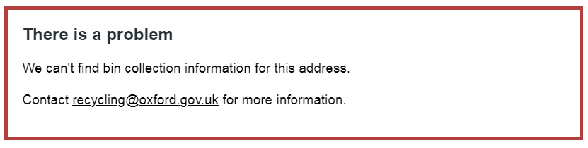
Our satisfaction feedback and hotjar monitoring recently identified an issue we needed to factor in.
There are two circumstances where a valid Oxford address will not return a result:
- The address is a business and so won’t have a domestic waste collection
- We don’t have details of the address on our lookup (the reasons for this are too complicated and embarrassing to go into - we’re working on it!)
So a small set of users were left with no information being returned on their search, and no information about what to do next.
A bit of investigation discovered that there was an existing error message to cover this, but it had been incorrectly added meaning it didn’t run. That was a quick fix.
We then needed to tell people there was an issue and what to do next. We kicked around ideas, including trying to explain why they wouldn’t be on our lookup, but felt this could create the impression their bins would not be collected.
In the end we decided on simplicity as the best approach