This week we finished the first stage of a project with our colleagues in Council Tax. This has been road testing a new approach to working with services to find solutions to customer problems more quickly.
Auditing our content
We had already decided that a major project for the next two years was to review all our website content, review its performance and rewrite/add/delete where needed to ensure we were meeting user needs.
We also knew from our LocalDigital Chatbot project that we can make a big difference to a user journey by focusing on better web content. It also has the advantage of being quick and free to do!
After a few attempts at a full-year site-wide analysis using Analytics data we realised we weren’t making much progress. Our cookie opt-out has seen a 50% drop in recorded web traffic and edits to pages through the year resulted in multiple entries for the same page. Also, with the sheer volume of content to analyse we were in a ‘can’t see the wood for the trees’ scenario.
We needed to find a better way.
A team-by-team approach
Our Head of Service was keen to promote a service-wide approach to helping improvement rather than just picking off individual elements (such as web content). This worked well for us as we could shape our audit work around a single team, and also look a bit wider to see things in context.
The fabulous Laura Griffiths from Basis was drafted in to help us shape our approach, and the Council Tax team were selected as the ideal guinea pigs to start with due to their commitment to improvement and positive attitude to change. This gave us 10 days of consultancy input to use.
Our now refocused audit piece concentrated on:
- identifying all content and content types leading from the council tax landing page to show its volume and structure
- Page performance data on a month-by month basis to show seasonal trends and compensate for Analytics drop-off
Fast scoping
A kick-off meeting was held with main players from our team, Customer Contact and Council Tax to talk through what everyone saw as the problems facing the service.
One of the main issues was the ‘backlog’ of work (the time between receiving a communication from users and completing it) which has been as high as six weeks. The reasons for this delay were suggested as being:
- Repeat contact (chasing up submitted eforms)
- Requests for additional information not supplied (esp for email contact)
- The volume of contact overall exceeding staff capacity
We wanted to unpick these assumptions and find out what the real problem was
Discovery phase
Laura developed two hypotheses to be tested:
- “Removing email as a channel choice for customers will reduce the backlog and decrease unnecessary contact”
- “Allocating a mix of the oldest contacts and newest contacts will eliminate the backlog”
We also developed a suggested problem to solve:
“How can we gather customer information accurately via appropriate channels so that all enquiries are resolved in shortest time possible to meet customer and corporate expectations?”
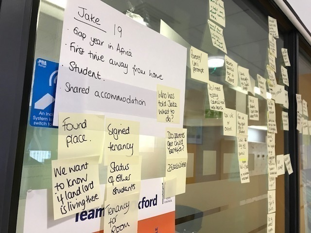
To start exploring this we developed a set of personas for users of the service to help us examine user journeys to identify how well user needs were being met.

We found some issues on the journey for our online forms:
- Confirmation messages for completed submissions included comments on the size of the backlog. While it’s good to help expectations around response times, this suggests the backlog had become almost commonplace/accepted
- There were also messages to promote registering to vote for our Moving In form which we traced back to a push on this from a few years ago. We felt there were other things we could include her to help people moving into the area (especially students)
- The inability for our (ageing) forms engine to easily allow uploaded documents impacts on the ease of processing student council tax exemption requests
- We realised our site-wide webchat didn’t extend across our forms pages because they are on a different server/domain.
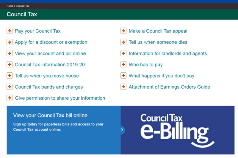
We also took a look at our landing page and how well it helped users complete their journey. Three years into our website contract we’d not touched the styling, and the growth and wording of links was starting to present a confusing picture.

Deep dive on data
Across the project team we listened to Contact Centre calls (65 No.), read a sample of emails (70 No.), sat with Contact Centre staff, and did some behavioural analysis with Hotjar. All this alongside our newly focused website audit data for Council tax.
What we found was:
- The most popular website action (32%) was paying council tax online, with 87% of users finding the page within 3 clicks and 73% of users reaching it within 20 seconds. Surprising for us, ‘get a council tax bill by email’ was the 2nd most popular action (16%)
- There was around 10% of content (mostly downloads) that were being hosted as an archive rather than meeting a current user need
- The majority of the backlog was due to email. It was established that 70% of this contact could be completed as an online form.
- Of 70 emails to the generic council tax email address the majority were from landlords/agents to notify us of a tenancy change. This was in preference to using the (highly used) online form - most likely because this had always been accepted by our council tax team and not challenged.
- Only 7% of emails and calls related to users chasing progress, contrary to the initial hypothesis about the potential causes
- Around 23% of calls were promoted by receiving a letter or court summons
So we managed to disprove immediatelyat least one of our assumptions - that most of customer contact was due to delays in processing.
What we’ve done so far
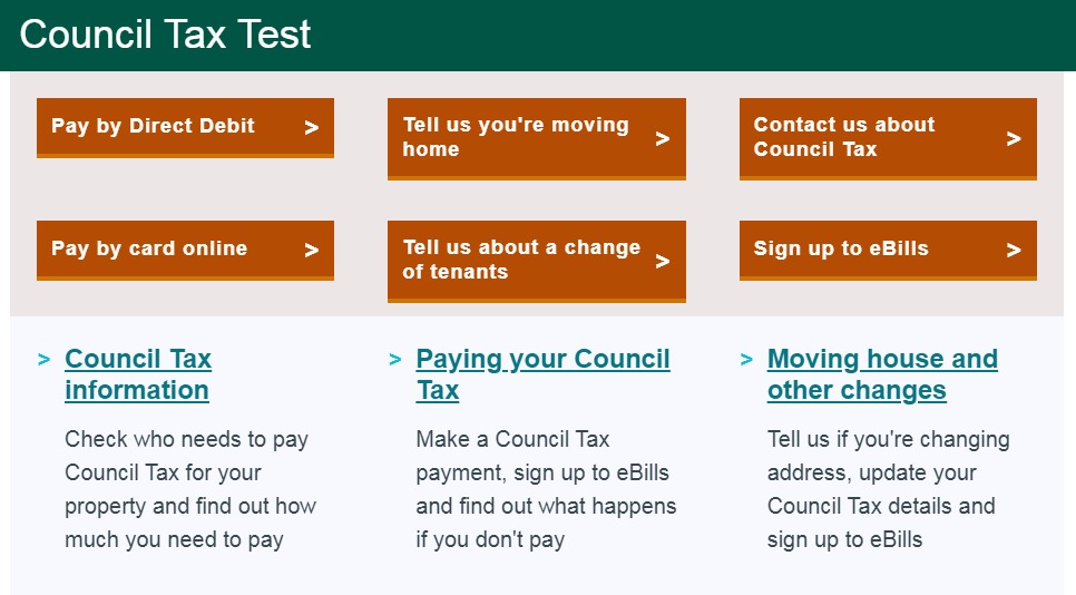
We’ve undertaken another team collaborative task to redesign our landing page. We selected this new design after looking at approaches by around 15 councils and arriving at a preferred choice based on Bristol, Brighton and Bracknell Forest.
Again, a rapid prototyping approach with multiple iterations helped us arrive at something that the project team were really pleased with, and will have benefits across the rest of the site as we roll out our team-by-team approach.

We’re planning on deploying this with a request for feedback along with Hotjar heatmaps and recordings to review how well it works for users, and make any changes needed.
For our webchat deployment on forms pages we’re setting up a new Tag Manager container to handle it and adding it into the template. We’re hoping this will help improve completion rates and give users extra confidence there is help at hand if they need it.
What we’re doing next
This has only been the initial phase of the project, aimed at arriving at solutions quickly in a more agile way. It’s been great to be part of something that has been focused on finding out the real issues and moving to actions quickly.
We’re going to start testing the changes we think are needed - if they work, they’ll stay. If they don’t, we’ll change them.
What we’ll be doing next is:
- Rewriting 2nd and 3rd level web pages and landing pages to better reflect the new home page and ensure that all aspects of the identified user needs are covered off
- Improving the confirmation messages on our Council Tax forms. While we want to encourage voting, there are other services we want to signpost users to, especially students
- Removing contact supplements on pages where they are not needed to discourage unnecessary emailing
- Replacing the single generic email with topic-specific emails to help structure responses that require an attachment. We’d rather get rid of emails altogether, but currently we’re not able to use our online forms to upload/send documents (long story)
- Developing a simple contact form (for enquiries without attachments) that collects and structures information better to help Council Tax staff process them quickly. We’ll be mindful of the work done by Croydon on this to make sure we design it well
We’ve also hit on the idea of formalising the approach into an improvement toolkit, to help teams we work with in future understand how the process works and the tasks that might be involved.